Visualizing risk, return, and time
October 2, 2017
Investors usually understand returns.
But risk… risk is more difficult. Risk involves communicating not just that many outcomes are possible, but how likely they are.
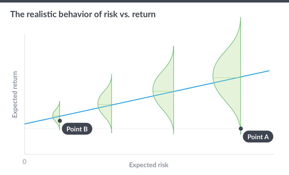
So I’m in favor of anything that gives investors a better intuition of what risk really is. Andy Rachleff’s post on how the standard efficient frontier graph often misleads investors resonated with me. Investors do often have the perception that the highest return portfolio is best, ignoring the risk.
To communicate the risk visually, he included probability distribution of potential outcomes vertically, which is a very nice touch. Kudos. Well done.
But… it was still misleading! Notice how it still looks like the highest risk portfolio was best: the potential downside of each portfolio is pretty much the same, but the high risk portfolio has substantially more upside? That’s not an accurate portrayal of risk and return 1.
So what does it really look like?
Realistic risk and return
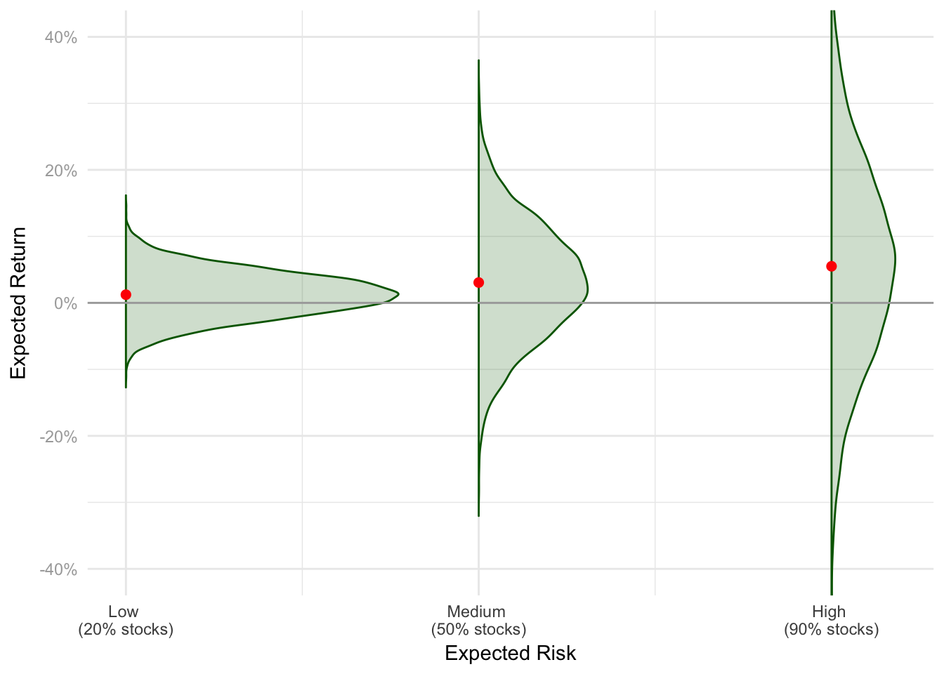
All the graphs below were created by creating different risk level portfolios by blending a risk (and return) free asset with a risky, higher returning one. The risk asset has a mean annual return of 6% and volatility of 17%. When we say 100% risk, that’s the 100% risky asset. If you want to modify this code, you can fork it here yourself.
The graph below is a realistic version of the graph. In this case, expected risk and return over a one year investment horizon. The dot represents the average expected return. Notice how they all seem like they’re at about roughly the same place, compared to the difference in ranges? This shows the much greater potential for downside in higher risk portfolios. In the short-term, the dominant driver of loss size is the variance of the portfolio.
It gets better with time
However…. these are expected returns over just a one year horizon. What if we take those same portfolios, and invested for longer periods of time?
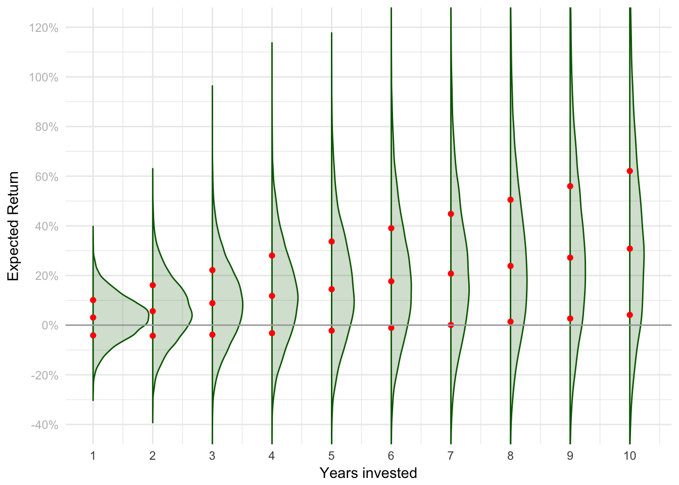
Let’s start with a 50% risky asset portfolio, and look at the cumulative return distribution at each year from 1 to 10. As we invest for longer and longer, the mass of probability smears upwards: our upside odds improve. The dots on each graph correspond to the 20th, 50th, and 80ths percentile outcomes in each case. Note how initially the bad outcomes involve losses, but over time even the worse cases gets better? Sometimes even positive?
All together now
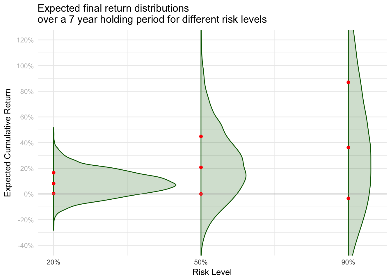
The graph below shows the cumulative return distributions for 20%, 50% and 80% stock portfolios over a 7 year investment horizon. You can see that the 20% stock portfolio doesn’t have a huge range of outcomes, but the 80% stock portfolio does.
However, the bad outcomes in the high-stock portfolio (the lowest red dot) is only slightly worse than in the low-stock portfolio. But the median and good outcomes are substantially higher. Similar downside, better upside. This is the closest I could get to Andy’s original graph - it took time.
Takeaway
It’s only when we invest over longer periods of time that we begin to see higher risk investments dominate lower ones.
In the short term, the variance in outcomes dominates the chance you’ll lose money. In the long term, the average matters more. This is why time horizon is such an important part of determining the right risk level for an investor.
Caveats
I used very simple, straightforward assumptions about the risk and return here. If you want to include mean reversion, volatility clustering etc, feel free to modify the code (written in R) and use whatever data-generating-process you want. I don’t believe it’s core to the point of the piece.
To be clear, I’m not ragging on Andy. He had good intentions, and that’s clearly a stylized example. I don’t know of anyone else who stopped in their tracks when they saw it. I’m just a pedantic nerd. ↩︎