Illustrating the long-term vs short-term
June 1, 2012
A while ago the great graphics gurus (sorry) at the NYTimes created a very cool graphic showing the annualized returns of the S&P500 over a long time period: 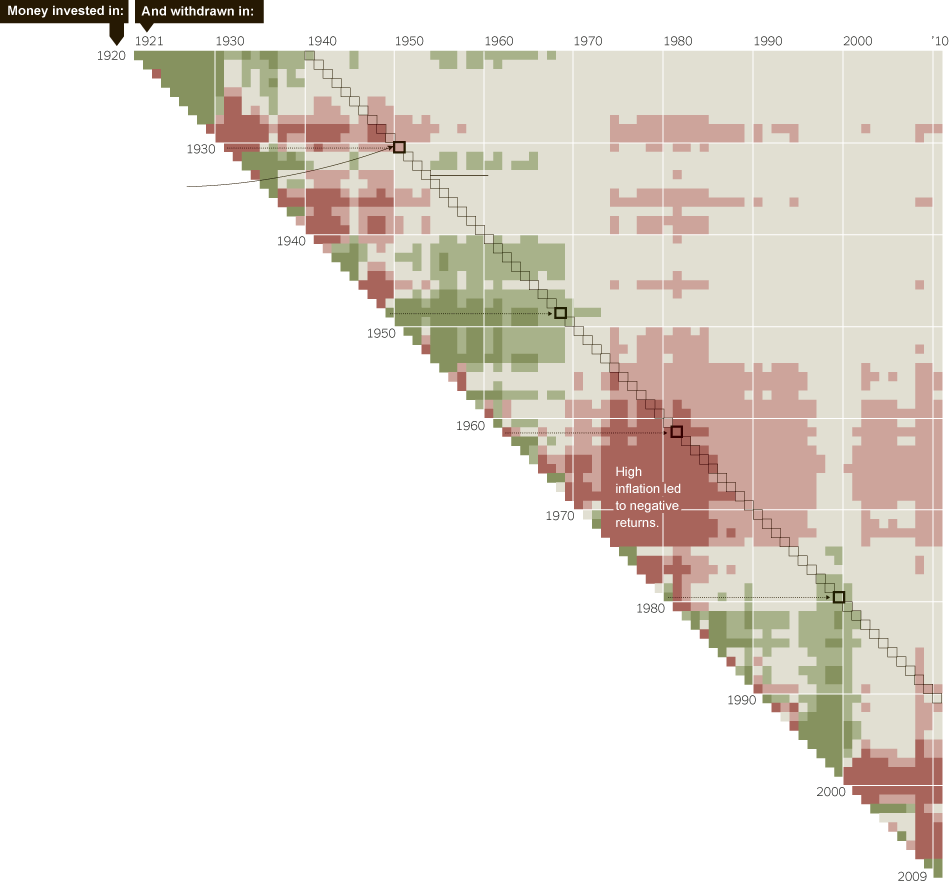 This was one of the best graphics I’d seen in a while, but there are a number of things I thought could be improved, or used to illustrate another point.
- Red doesn’t mean loss. The light red in the picture means a return slightly above inflation. I think it’s misleading to color a real gain as a red loss.
- The grey is likewise misleading a bit. Grey is the 20 year median, which equates to 4.1% higher than inflation. That’s not boring and grey - that’s happy and green! It’s possible it’s grey because of how it compares with cash, but cash was not yielding 4% in real terms through much of that period.
- Everything is observed in years. But in the short-term, the first few months can really drive a years return.
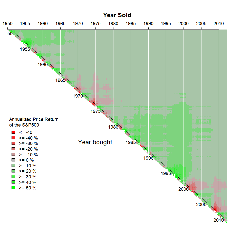
What is great is that it’s actually fairly easy (ok, it did take me a few hours) to replicate this graph using completely free software. Using the statistical package R, you can literally run this file, and get the graphs below. First up is just attempting to recreate the graph, which took a bit more manipulation than I expected, but was doable. Things to note:
- My data are not exactly the same. The NYTimes graphic adjusts for dividends, average taxes and fees, and inflation. In that respect, their data is superior to mine.
- Each cell on my graph represents an average annualized monthly return, even if it represents just one month. Annualizing a monthly return can produce some extreme values.
- I inserted a black line at the 1-year holding period.
What this shows me is that most of the bright red occurs within the 1 year time period, along the diagonal. (not discounting point (2) above)
I wanted to focus the graph a bit more on the influence of holding periods on returns, so I rejigged the graph slightly to focus on holding periods. I really like the result:
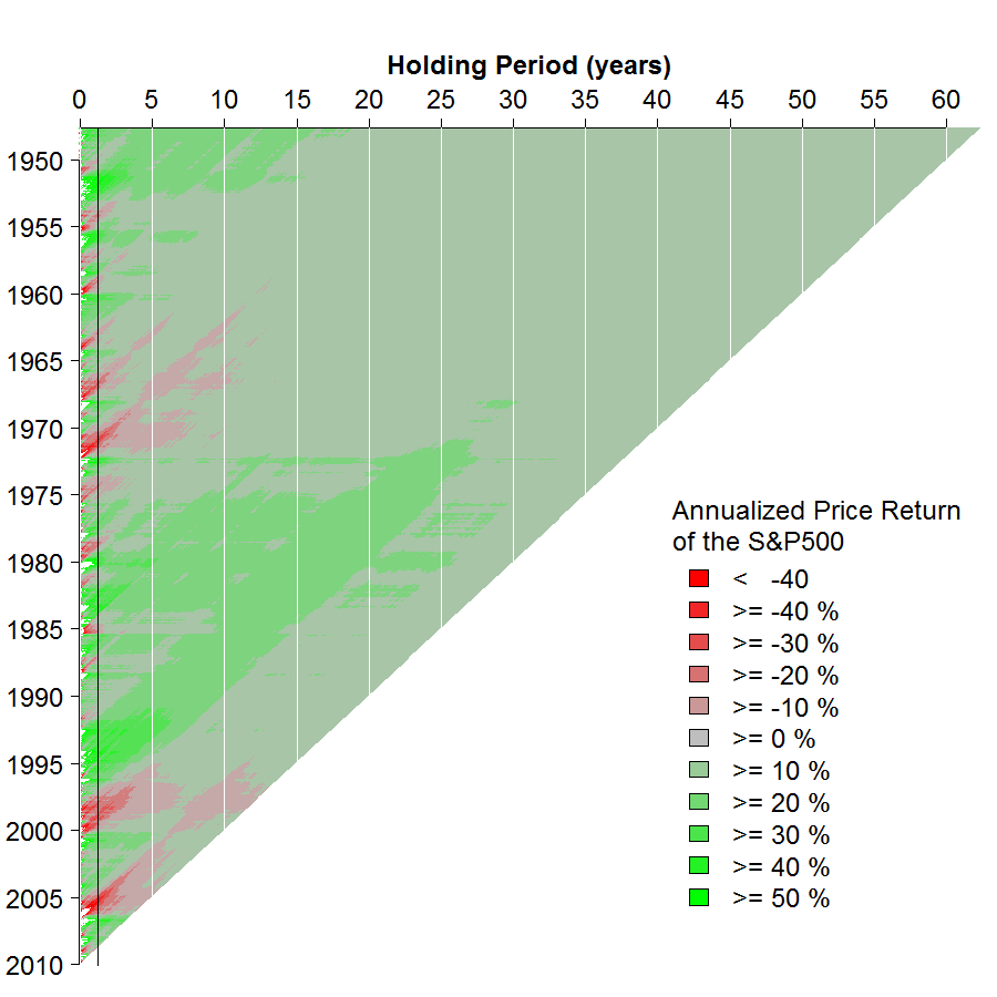
- You can now see how much more volatile 1 year holding periods are.
- You can likewise see how there are very few cases when a nominal loss lasts for more than 10 years - almost never. Taxes, inflation and fees will make this graph look worse, but dividends will make it look better.
- It focuses me on the long-run. It shows that even if I had invested right before the worst months of the 1970s, in about 7 years of holding tight I’d be in the same place as someone who’d invested right before the boom years.
- I look at this graph, especially every line longer than 15 years (and I’m definitely investing for more than 15 years), and see that it doesn’t matter if I invest now, or a year from now. Over that time frame, there is little risk around choosing when to invest.
- We are currently going through quite a tough patch, but the last time we had such a tough patch, it didn’t really affect returns above 12 years. I don’t know what the bottom half of this graph will look like in the future, but the top gives me comfort that it can’t be that bad.
What do you think?